This website and project
Listen to the last fifty years of music from the cover page here.
Sources
Our research is based on the dataset “Evolution of Popular Music: USA 1960-2010”by the Royal Academy of Engineering Research Fellow, Matthias Mauch. This was a CSV file compiled of the artist names, song titles, and various other musical metadata of the Billboard Hot 100 entries per every quarter in the fifty year time period aforementioned. The Billboard Hot 100 is the music industry standard for song and artist rankings and is based on album profit and song play time. More information on our dataset can be found on our Data Critique page.
We used seven research articles on various topics related to gender and popular music to provide context to our findings. For information on our sources, check out our Annotated Bibliography.
Process
The findings of our research are based primarily on the “Evolution of Popular Music: USA 1960–2010” dataset, collected by Matthias Mauch. We first made sure our data was usable with the data cleaning tool Breve. After mending gaps and fixing errors, we looked over our metadata headings to see what we could extract from this dataset. We quickly decided to exclude the technical elements about music (timbre, harmonies, etc) because none of our members had any expertise on music to this degree. We agreed to focus on metadata such as information about artists and song titles and played with the data to see what we could get out of this information.
Given the size of the dataset (over 17,000 entries!), we hoped taking a more specific perspective would be a manageable window into the relationship between pop culture and political change. We originally chose the two-year window of 1965-1967 because of the racially motivated political unrest, specifically the Detroit and Watts riots, and hoped to discover what effect these events had on the frequency of specific words in the titles of songs at the time. Unfortunately, this two year period proved to be too specific for our dataset and brought inconclusive results. We decided to pivot from this original focus because as we created more and more visualizations, we started to understand the limitations of our dataset. We realized that taking a gender-focused approach would generate more interesting results and focused changes in the dataset as a whole.
Upon refining our search and understanding the limitations of our dataset, our thesis came to us relatively quickly:
Does a more representative gender ratio of the Top 100 artists (1960-2010) change the gendered dialogue found in the most popular songs?
We created many excel sheets for different subcategories of data in order to create the visualizations. Realizing textual analysis was necessary, we used Voyant to make sense of the song titles. Among other spreadsheets, we created a new table for each year where we only had the song titles of every single year in the data set. This allowed us to figure out the most common words but also specific trends that we felt were interesting enough to be analyzed. We settled for “gendered words” such as boy, girl, man, and woman because we had enough repetition within our song titles to show a trend.
We created the word map using the Voyant word cloud and illustrator. We used Tableau for the rest of the visualizations including the pie charts, treemap, timeline and even the birthplace map to maintain consistency in coherency and design. The only chart that had to be done on Google sheets was the “Gendered words compared to artist gender by decade” line graph because Google sheets gave us more flexibility with the representation. We made sure to keep the color scheme so that the visualization did not look out of place. Finally we used Palladio to create a network visualization of how the word Baby is connected to to other words in song titles. For that we used a Python file (created by our very helpful TA Craig) that generated a list of all the words that appeared on the left side and how the right side of baby in the data set. We chose to focus on the left side (words that came before baby) and showcased in the visualization the words that appeared at least 5 times using Palladio.
In the end, we came out with five visualizations, two maps, and one timeline displaying different aspects of artist gender and gendered words. Our visualizations will be discussed further below, but they include:
- Visualizations
- Pie chart of gender of top 100 artists – Entire data set and per decade
- Tree map of artist gender
- Circle visualization of artist gender
- Gendered words compared to artist gender by decade
- Network graph of words associated with baby
- Maps
- Map of birthplace of artists
- Word US Map
- Timeline of frequency of gendered words across the years
Presentation
We presented our findings on this Humspace hosted WordPress website, provided courtesy of UCLA and its department of Digital Humanities. We featured outside research and related it to our five visualizations (a treemap, pie chart, bar-circle graph, artist gallery, and a time-based line-bar graph); two maps (a world map of artist birthplace and a word map of most frequent US song title words); and a one timeline of gendered words over the years. Our narrative, findings, and visualizations mentioned can all be found on the front page!
Meet the Team
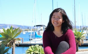
Corine Tan

A second-year English major planning to minor in Entrepreneurship at UCLA. Corine designed the website, edited the final text, and helped with the general management of the project. A fun fact about her is that she’s currently working on a novel about 1920s San Francisco.
Constance Morisseau

A third-year Business Economics major, minoring in Digital Humanities at UCLA. Constance worked on data cleaning and designed all the beautiful visualizations on this site! She also helped explain our results and helped guide this project. A fun fact about her is that she can make amazing crepes.
Sara Finnegan

A fourth-year Economics major planning to minor in Entrepreneurship at UCLA. Sara wrote a lot of the content you see on this website, including the Introduction, two sources, and the project significance. A fun fact about her is that she’s planning on moving to New York City after graduation to work in finance.
Dannie Nguyen

A third-year Communications major at UCLA. Dannie helped write the narrative including two sources and the conclusion, along with integrating sources to data visualizations. A fun fact about her is that she just finished up an internship Fall quarter with FOX with their digital marketing team.
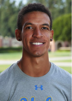
Idrees Bernard

A fifth-year Sociology major, minoring in Digital Humanities and Environmental Science at UCLA. Idrees helped write on his source in the narrative, did data entry, and created the smaller playlist not featured on the website. A fun fact about him is that he runs track and field for UCLA.
Acknowledgements
Our team would like to acknowledge and thank Professor Garcia of DH101 for guiding us through the necessary skills and deadlines to complete this project. We would also like to thank our TA Craig Messner for helping answer all the questions we had and helping us code for our Baby Visualization. We would also like to thank the team at Humspace for helping host this website in partnership with UCLA. Last but not least, we would like to thank the team at Young Research Library (YRL) at UCLA for teaching us research techniques, and tools to guide our findings.
Our website uses the Audioman Theme and a video found on YouTube created by Cox Content.
